
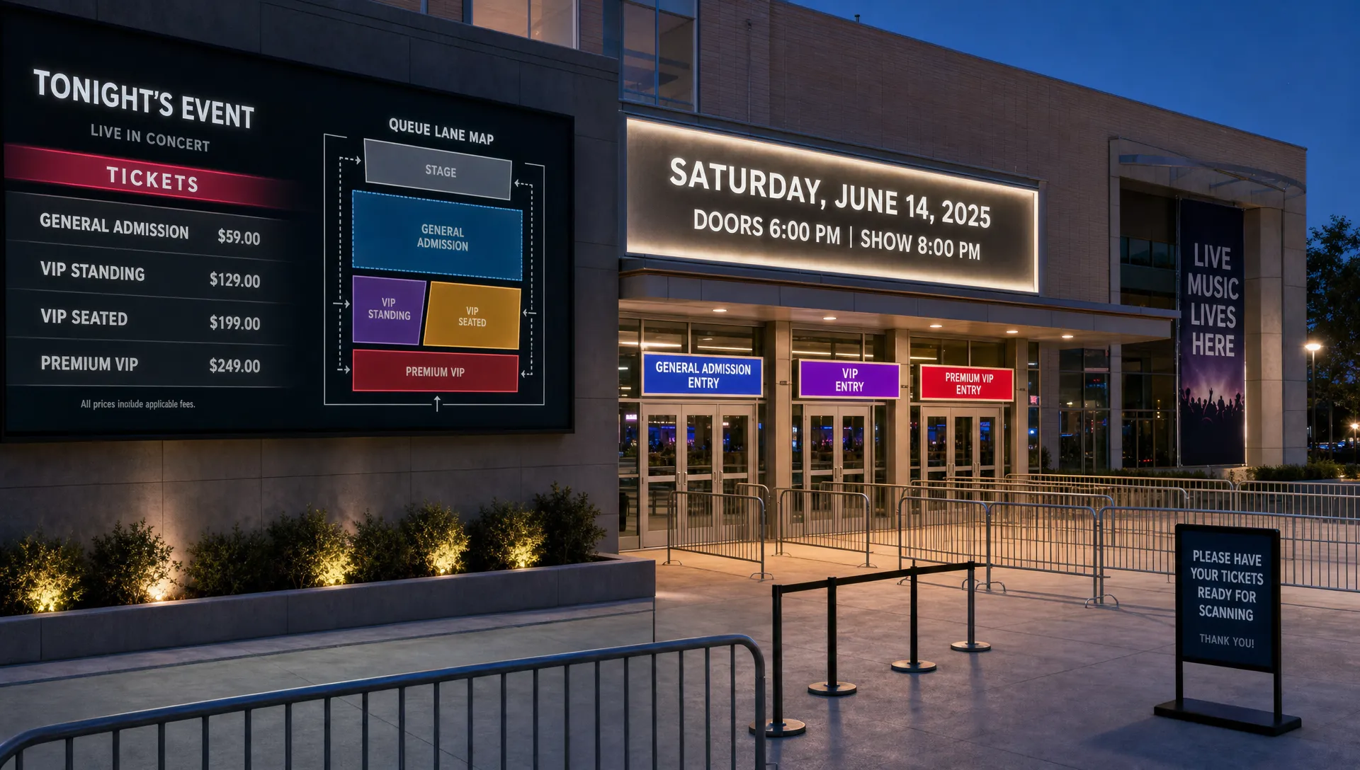
How to List Tickets for Sale Without Confusing Buyers
When a buyer lands on your ticket page, they are trying to answer a few simple questions fast: is this the right event, which ticket should I buy, what will it cost and what happens after I pay? If your listing makes any of those answers hard to find, hesitation creeps in.
For organizers, music producers and small event teams, that hesitation is expensive. It can turn into abandoned checkouts, repeated DMs, wrong ticket purchases, refund requests and a slower cash cycle. A clear listing does not need to be long or flashy. It needs to make the buying decision feel obvious.
This guide focuses on how to list tickets for sale in a way that reduces confusion from the first page view through entry at the door.
Confusion usually starts before checkout
Many organizers assume the checkout is where sales are won or lost. Checkout matters, but confusion often begins earlier, when the buyer is still deciding whether they are in the right place.
Nielsen Norman Group's research on web reading behavior has long shown that people scan pages rather than read every word. That applies heavily to event listings. Buyers skim the event name, date, price, location and ticket options, then decide whether to continue.
If your page forces buyers to interpret unclear tier names, compare overlapping offers or search for age restrictions, you are asking them to do extra work. Some will message you. Some will pick the wrong ticket. Many will simply leave.
Common signs that your listing is confusing include buyers asking whether a ticket includes entry, whether VIP includes seating, whether a sold out tier will return or whether a promo code applies to their ticket. Those questions are not just support issues. They are clues that the listing is carrying too much ambiguity.
Build the listing around the buyer's first decision
Before you list tickets for sale, define the most likely path for a buyer. For most events, that path is simple: understand the event, choose a ticket, pay and receive proof of entry. Your page should support that path without making buyers stop to decode the offer.
The top section of the listing should answer the essential questions before the buyer scrolls too far:
- What is the event and who is it for?
- When does it happen, including date and start time?
- Where is it, including venue name and city?
- Which ticket should most buyers choose?
- What does the buyer receive after purchase?
This is not the place for every sponsor, performer bio or production note. Those details can support the sale lower on the page, but they should not compete with the buying decision.
A useful test is to show the listing to someone who does not know your event and give them ten seconds. If they cannot tell you what the event is, when it happens and which ticket they would buy, the page needs more structure.
Use ticket tier names that answer “which one is for me?”
Ticket tier names are often where confusion starts. Internal names that make sense to your team may not make sense to buyers. “Phase 2,” “Release B” or “Supporter” can work only if the buyer immediately understands what changes between options.
A clearer naming pattern is: timing or audience, access level and quantity. For example, “Early Bird General Admission” is easier to understand than “Wave 1.” “Group of 4 General Admission” is clearer than “Squad Pack.” You can still use personality in your event copy, but the ticket name should stay practical.
| Confusing ticket name | Clearer alternative | Why it works better |
|---|---|---|
| Release 2 | General Admission, Second Release | Explains that it is still standard entry, just a later price phase |
| VIP Plus | VIP Entry With Balcony Access | Shows what the upgrade actually includes |
| Table B | Reserved Table for 4 | Clarifies quantity and seating type |
| Artist Supporter | Supporter Ticket, General Admission Included | Makes clear that the buyer still gets entry |
| Final Drop | Final General Admission Tickets | Communicates urgency without hiding the ticket type |
If you are still deciding what kinds of tickets to offer, TixFlow has a practical guide on choosing the right type of ticket for any event. The key is to avoid creating tiers that are different in name only. Each option should have a clear reason to exist.
Explain what each ticket includes
A buyer should not have to guess what they get. For every ticket tier, write a short description that covers the access, limits and any meaningful benefit.
For a music event, “VIP” could mean early entry, a better viewing area, a meet and greet, a drink token or simply a higher support price. If you do not explain it, every buyer will define it differently. That creates mismatched expectations and more work for your door team.
A strong tier description usually covers these details in one or two concise sentences:
- Access level, such as general admission, balcony, backstage or reserved seating
- Quantity, such as single entry, pair, group or full table
- Time restrictions, such as early entry or last entry
- Included extras, such as merch, drinks or meet and greet access
- Important limits, such as age rules, nontransferable names or no reentry
Keep descriptions specific, but not crowded. A buyer scanning a mobile screen should be able to compare tiers without opening a spreadsheet in their head.
Explain prices, fees and timing before the buyer has to ask
Unexpected costs are one of the fastest ways to lose trust. Baymard Institute's checkout research consistently identifies extra costs and account requirements as common reasons shoppers abandon purchases. Ticket buyers are no different. If a price changes at checkout because of fees, taxes or add-ons, the buyer may feel misled even when the fee is legitimate.
The cleanest approach is to show the buyer what they will pay as early as possible. If fees are added, make them visible before the final payment step. If fees are absorbed into the ticket price, make the displayed price the real buyer price. Either approach can work, but hiding the difference until the end creates friction.
This matters for your cash flow too. Clear pricing helps you forecast revenue by tier instead of trying to reverse engineer the numbers after orders come in. TixFlow's flat per-ticket fees are designed to make that math easier for organizers, especially when you are planning staged releases or comparing net revenue across ticket types.
If your main concern is protecting your margin, it is worth pairing listing clarity with the broader pricing approach covered in TixFlow's guide to selling tickets without cutting into revenue.
Keep sales phases and promo codes simple
Sales phases can drive urgency, but they can also confuse buyers if too many options are live at once. A common mistake is showing Early Bird, General Admission, Last Chance and Door Price tiers all at the same time without explaining which one is active.
If a tier is no longer available, hide it or mark it clearly as sold out. If a tier opens later, state when it opens. If a price ends on a specific date, include the date, time and time zone. “Ends soon” can be persuasive in an ad, but on a ticket page the buyer needs specifics.
Promo codes need the same discipline. A buyer should understand whether a code applies to a ticket type, a group, a date range or a private audience. Codes like “FRIENDS10” or “STUDENT15” are easier to understand than vague labels like “SPECIAL.” Avoid running multiple public codes that overlap unless you have a clear reason.
TixFlow supports automated sales phases and smart promo codes, which helps organizers control timing without manually editing the page during a busy campaign. The strategic point remains the same: automation should make the sale clearer, not create a maze of hidden rules.
Design checkout for speed, not data collection
Every extra field in checkout asks the buyer to slow down. Sometimes that field is necessary. Often, it is just habit.
For most events, you need payment details, buyer contact information and ticket delivery information. You may need attendee names if you are using a guest list or checking IDs at entry. You probably do not need the buyer's company, full mailing address, social handle or birthday unless those fields support a real operational need.
Forced account creation is another source of friction. A buyer who is excited to attend a show should not have to create a profile before they can pay. TixFlow avoids buyer registration, which keeps the path from selection to payment shorter.
Mobile checkout deserves special attention. Many buyers purchase from an Instagram bio, text thread, artist story or event announcement. If the listing looks clear on desktop but cramped on mobile, the buyer experience is still confusing. Review the page on the devices your audience actually uses before you launch.
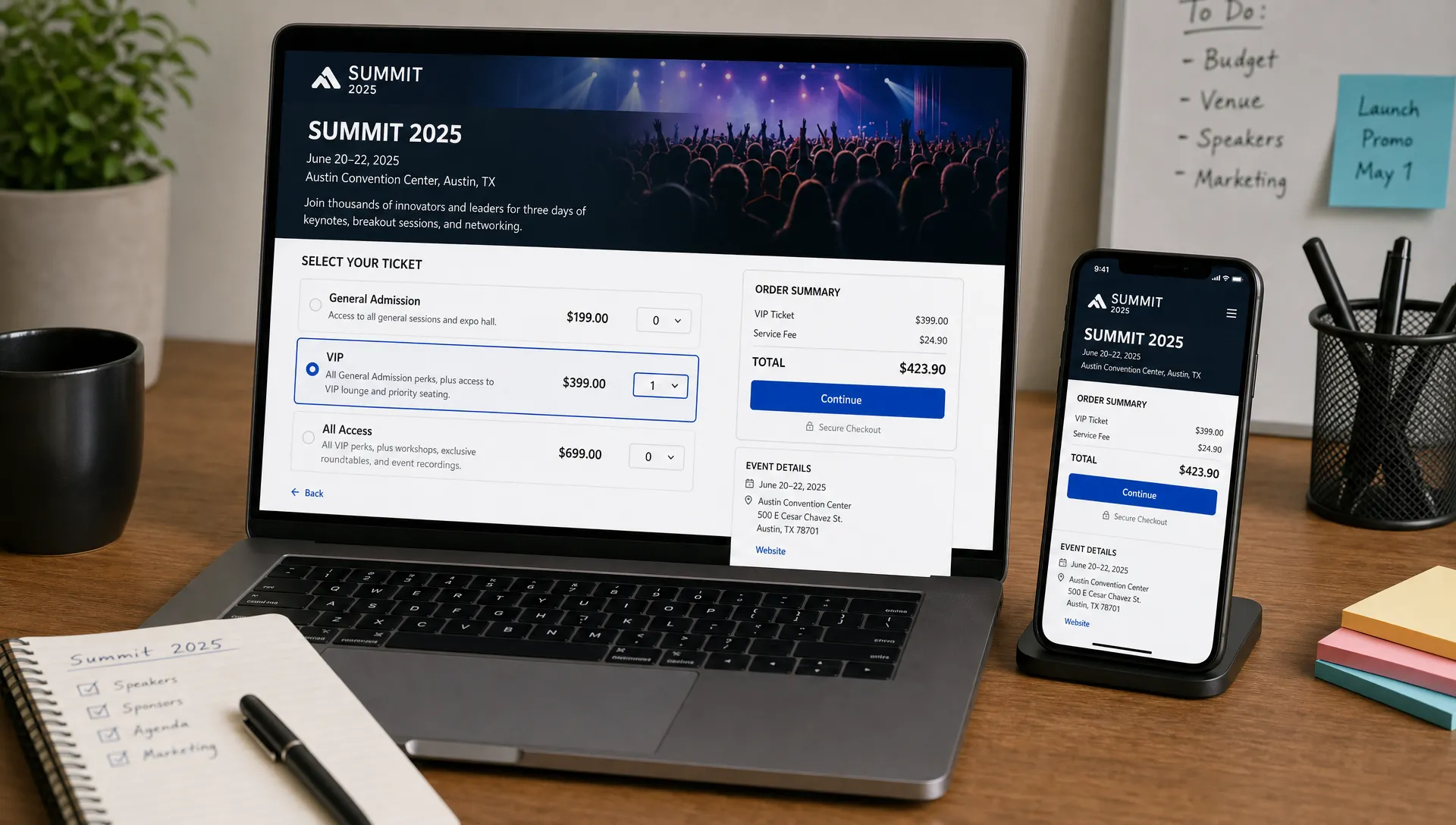
Make the event page easy to scan
A ticket listing should have a visual hierarchy. The buyer should not have to read from top to bottom to find the basics. Key information belongs in predictable places, with short sections that support quick comparison.
| Buyer question | Best place to answer it | Mistake to avoid |
|---|---|---|
| Is this the event I want? | Event title, short promise and hero section | Opening with a long paragraph before the basics |
| Can I attend? | Date, time, venue, city and age rules | Hiding age limits or last entry details in fine print |
| Which ticket should I buy? | Ticket tier names and descriptions | Using internal labels buyers do not understand |
| What will I pay? | Ticket selector and checkout summary | Revealing fees only at the final step |
| What happens after purchase? | Checkout copy and confirmation message | Leaving buyers unsure where their ticket will arrive |
| How do I enter? | Confirmation and ticket details | Using names at the door that differ from tier names online |
This is also where design restraint helps. Too many badges, banners, countdowns and competing calls to action can make the page feel loud. Use emphasis for the most important action, buying the right ticket, and keep secondary information easy to find without making it fight for attention.
If you want to go deeper on the page copy itself, TixFlow's guide to writing a ticket listing that drives more sales covers how to shape the event promise, tier descriptions and conversion flow.
Prevent confusion after the sale
A clear sale does not end when payment succeeds. The buyer still needs to know how to find the ticket, what to bring and what to expect at entry. If your confirmation message is vague, confusion simply moves from the ticket page to your inbox.
A strong post-purchase experience includes the event name, date, venue, order summary, ticket quantity, entry instructions and support contact. If arrival time matters, state it. If ID is required, say so. If tickets are scanned digitally, tell buyers to have their phone ready and the ticket accessible.
Your door team should use the same ticket names that buyers saw online. If the buyer purchased “VIP Entry With Balcony Access,” the guest list should not call that tier “VIP B.” Small mismatches slow down the line and make staff look unsure, especially at high-volume entry windows.
Digital guest lists can help when the event team needs real-time visibility at the door. TixFlow includes digital guest lists, so organizers can keep ticket sales and entry operations connected instead of managing separate spreadsheets.
Preflight checklist before tickets go live
Before you publish, review the listing like a first-time buyer rather than the person who built the event. The goal is not to make the page perfect. The goal is to remove the avoidable questions that block a purchase.
| Review area | Clear if... | Fix if... |
|---|---|---|
| Event basics | Date, time, venue and city are visible near the top | Buyers must scroll or read body copy to confirm details |
| Ticket names | Each tier explains access and purpose | Names rely on internal slang or vague labels |
| Tier descriptions | Buyers can compare options quickly | VIP, group or supporter tickets lack inclusions |
| Pricing | Buyer can understand the total before payment | Fees or taxes appear unexpectedly at the last step |
| Sales phases | Active, upcoming and sold out tiers are obvious | Multiple phases appear live without context |
| Promo codes | Code rules are limited and easy to explain | Buyers need to guess which ticket a code applies to |
| Checkout | Only necessary fields are required | Optional marketing fields block payment |
| Confirmation | Buyer knows where the ticket is and how to enter | Confirmation only says the order was received |
Run this checklist before your first announcement, not after traffic arrives. Once a campaign is live, every unclear detail creates support work at the exact moment your team should be focused on promotion.
Where TixFlow fits into a clearer ticket sale process
The right platform cannot fix a messy offer, but it can make a clear offer easier to execute. TixFlow is built for organizers who want a fast purchase experience for attendees and tighter control behind the scenes.
Customizable event pages help you present the event and ticket options in a way that matches your audience. Unlimited ticket tiers give you flexibility, while automated sales phases help you avoid manual updates when pricing changes. Real-time sales control lets you respond during the campaign instead of waiting until after the event to understand what happened.
On the buyer side, no registration reduces friction. On the organizer side, instant payouts, flat per-ticket fees and Stripe Connect integration support cleaner cash flow. Those details matter when you are paying deposits, managing production costs or planning the next release.
The best ticket listing is not the one with the most information. It is the one that gives the buyer the right information at the right moment, then gets out of the way.
Frequently Asked Questions
How do I list tickets for sale clearly? Start with the event basics, use plain ticket tier names, explain what each ticket includes, show pricing and fees early, then keep checkout short. A clear listing helps buyers choose without messaging your team for clarification.
How many ticket tiers should an event have? Use as many tiers as you need to reflect real differences in access, timing, seating or quantity. Avoid adding tiers that only change the label. For many events, a simple structure like Early Bird, General Admission and VIP is easier to buy than a long list of similar options.
Should I show fees before checkout? Yes. Buyers are more likely to trust the purchase process when they understand the total cost before the final payment step. If you charge fees separately, show them clearly. If you include fees in the displayed price, keep that price consistent through checkout.
What causes buyers to choose the wrong ticket? Wrong-ticket purchases usually come from unclear tier names, missing descriptions, overlapping sales phases or benefits that are not explained. If VIP, group, seated or timed-entry tickets are involved, descriptions should be especially specific.
How can I reduce support messages after tickets go on sale? Review the questions buyers asked at past events and answer them directly on the listing. Add age rules, arrival details, ticket inclusions, refund or transfer notes and entry instructions where buyers can easily find them.
Launch a clearer ticket sale
If you want to list tickets for sale without slowing buyers down, build the experience around clarity from the first click to the door. With TixFlow, organizers can create customizable event pages, manage ticket tiers, automate sales phases, use smart promo codes and give attendees a registration-free checkout built for speed.