
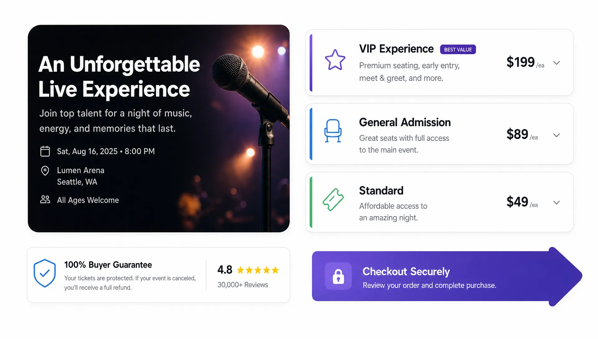
How to Write a Ticket Listing That Drives More Sales
Your ticket listing is the moment where interest either becomes revenue or disappears. A buyer has clicked from an ad, a social post, an artist announcement, an email, or a friend’s message. Now the listing has to answer one question fast: “Is this worth my time, money, and commitment?”
A strong listing does more than publish a date and a price. It frames the value of the event, reduces uncertainty, makes ticket options easy to understand, and moves people toward checkout without unnecessary friction. For organizers, music producers, promoters, and event teams that care about cash flow, this is one of the highest leverage pieces of sales copy you can improve.
Treat the ticket listing like a conversion page
Many organizers write ticket listings as if buyers are already convinced. They lead with logistical details, then add a short description, then hope the lineup or brand name carries the sale. That can work for loyal fans, but it leaves money on the table with undecided buyers.
A better approach is to think of the listing as a compact sales page. It should confirm the promise of the event, make the purchase feel low risk, and make the next step obvious. This is especially important for mobile visitors, who may be deciding while commuting, standing in line, or replying to a group chat.
The goal is not to exaggerate. The goal is clarity. A buyer should understand what the event is, why it is worth attending, which ticket to choose, and what happens after purchase.
| Listing element | Buyer question it answers | Why it drives sales |
|---|---|---|
| Event promise | Why should I go? | Creates motivation before price becomes the focus |
| Key details | Can I actually attend? | Removes basic uncertainty about time, place, and access |
| Ticket tiers | Which option is right for me? | Reduces decision fatigue and supports higher order value |
| Trust signals | Is this real and reliable? | Lowers perceived risk before payment |
| Checkout flow | How fast can I buy? | Prevents drop-off from friction or forced registration |
If your ticket page is getting traffic but not enough sales, the issue is often not demand. It is usually a weak promise, unclear information, confusing tiers, or a checkout path that asks too much from the buyer.
Lead with the event promise, not the admin details
The opening lines of your ticket listing should make the event feel specific and desirable. Avoid starting with generic phrases like “Join us for a night of music” unless you immediately explain what makes this night different.
For a music event, the promise might be the sound, the scene, the lineup, the venue energy, or the cultural moment. For a workshop, it might be the outcome attendees will leave with. For a fundraiser, it might be the cause and the shared experience. For a local nightlife event, it might be the crowd, the theme, and the limited capacity.
Compare these two openings:
“Tickets are now available for our summer showcase at The Loft.”
“Three rising producers, one intimate warehouse room, and a late-night set built for fans of bass-heavy house. Capacity is limited, and the first ticket phase closes this week.”
The second version gives the buyer a reason to care. It signals genre, atmosphere, exclusivity, and urgency without overloading the reader.
A useful formula is: audience plus experience plus reason to act. For example: “For indie fans who want an up-close release night, this listening party brings the full EP to life with live visuals, guest sets, and a limited-capacity crowd.”
Make the essential details impossible to miss
Once the promise is clear, the listing should quickly answer the practical questions that decide whether someone can buy. Do not bury basic details inside long paragraphs. Buyers scan first, then read deeper if they are interested.
Include the essentials near the top:
- Event name and format
- Date, start time, and expected end time
- Venue name and full location
- Age restrictions, ID requirements, or entry rules
- Ticket prices, fees, and what each tier includes
- Refund, transfer, or cancellation policy
- Accessibility, parking, transit, or arrival guidance when relevant
Transparent information builds trust. It also reduces support messages, which matters when your team is trying to sell, promote, and prepare the event at the same time.
If you want a broader view of how page structure affects buyer confidence, the same principles appear in high-converting ticketing website design: clear information above the fold, mobile usability, transparent pricing, and a fast path to payment.
Write ticket tiers that help buyers decide
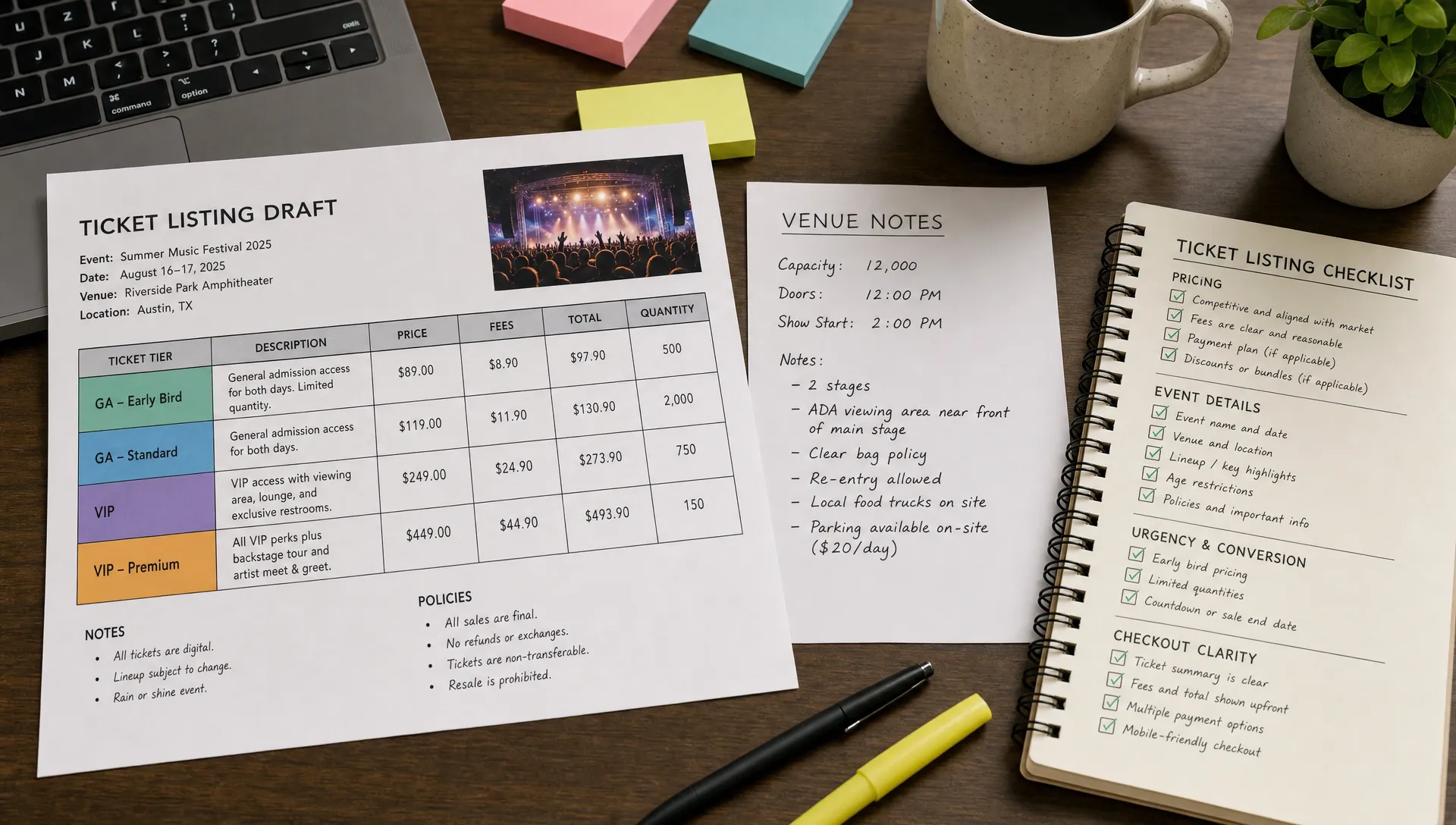
Ticket tiers should not feel like a puzzle. Each option should have a clear purpose, a simple name, and a reason it exists. If a buyer has to compare five vague ticket names, they may delay the decision until they forget entirely.
A good tier structure often follows buyer motivation:
- Early access for price-sensitive buyers who are ready to commit
- General admission for the main audience
- VIP or premium access for buyers who want a better experience
- Group tickets for friends who are coordinating together
- Last-call pricing for late buyers when demand is strongest
The copy for each tier should explain value, not just price. “VIP” is less persuasive than “VIP, priority entry plus reserved balcony access.” “Group ticket” is less persuasive than “Group of 4, arrive together and save compared with individual general admission.”
For organizers using TixFlow, unlimited ticket tiers and automated sales phases can support this kind of structure without forcing everything into one static price. The key is to keep the public-facing explanation simple, even if your backend setup is more strategic.
Use urgency without sounding desperate
Urgency helps buyers act, but only when it is credible. Fake countdowns and constant “almost sold out” messages can damage trust. A stronger approach is to connect urgency to real limits: capacity, ticket phases, artist demand, seating, group availability, or production timelines.
Examples of useful urgency copy include:
“Early pricing ends Friday at midnight.”
“Only 100 first-release tickets are available before general admission pricing begins.”
“VIP entry is limited due to balcony capacity.”
“Final ticket phase starts once current allocation sells out.”
This gives buyers a reason to purchase now without making the listing feel pushy. It also supports cash flow because earlier commitments help fund production, marketing, staffing, and venue obligations.
If you are planning a phased launch, your listing copy should match the calendar. For example, early-bird messaging should not still dominate the page after that phase ends. This is where a thoughtful sale calendar can build momentum, as explained in this guide to setting ticket sale dates for maximum momentum.
Make the listing easy to skim on mobile
Most buyers will not read your ticket listing like a brochure. They will glance, scroll, compare, and decide. Your formatting should support that behavior.
Use short paragraphs. Put the most important details near the top. Break up long descriptions with clear headings. Keep tier names concise. Avoid long blocks of all-caps promotional language. If you include a lineup, schedule, or performer list, make it scannable.
Also check how your listing feels after someone clicks “buy.” The strongest copy in the world cannot rescue a checkout that forces account creation, hides fees until the last step, or makes the buyer re-enter information they do not want to share. TixFlow is built around no buyer registration, flat per-ticket fees, and a customizable checkout experience, which helps reduce the friction that often causes abandoned orders.
Add trust signals before the payment step
Trust is part of conversion. Buyers want to know the event is legitimate, especially if they are discovering you through a shared link or paid promotion.
Your ticket listing can build trust with specific details rather than generic claims. Mention the venue if it is confirmed. Include recognizable partners, sponsors, collectives, labels, or artists when accurate. Add clear policies. Use professional visuals that match the event. Make sure the event page does not look unfinished.
For recurring events, include a short line that references past editions: “From the team behind last spring’s sold-out warehouse session.” If you have press, community recognition, or a strong creator following, mention it briefly. Do not overload the page with proof, but give undecided buyers enough confidence to continue.
Trust also includes operational clarity. If entry is via digital ticket, say so. If names must match IDs, say so. If doors close at a certain time, say so. Surprises at the door create support problems and can weaken your brand long after the sale.
Keep tax and compliance details out of the sales copy, but not out of your planning
Your ticket listing should stay focused on the buyer experience. That does not mean the business side can be ignored. Depending on your event type, location, pricing model, and organization structure, you may need to account for taxes, fees, reporting, or other compliance tasks outside the public listing.
Do not turn the event description into a tax explanation. Instead, keep buyer-facing pricing transparent while handling the admin side separately with qualified guidance. For organizers or businesses that are subject to federal excise tax filing requirements, an IRS-authorized online option such as eFile Excise 720 can help with Form 720 filing while your ticket page remains focused on selling the event.
The broader principle is simple: buyers need clarity, not back-office complexity. Your team needs both.
Write calls to action that match the buyer’s intent
“Buy tickets” is clear, but it is not always the strongest call to action. The best CTA depends on the tier, event type, and buyer mindset.
For early buyers, “Reserve early-bird access” can feel more specific. For limited seating, “Choose your seat” may be more relevant. For a music event with a strong lineup, “Get general admission” is straightforward. For premium tiers, “Claim VIP entry” connects the action to the benefit.
Microcopy near the CTA can also reduce hesitation. A short line such as “Digital ticket delivered instantly” or “No account required” can reassure buyers at the exact moment they are deciding whether to continue.
Do not add too many competing actions. A ticket listing should not ask people to buy, follow, subscribe, share, join a waitlist, read a bio, and watch a video all at once. If ticket sales are the goal, make purchasing the dominant action.
Match the listing to your traffic source
Not every visitor arrives with the same level of intent. Someone clicking from an artist’s Instagram story may already be excited. Someone arriving from search may need more context. Someone receiving a link in a group chat may be comparing logistics and price.
Your ticket listing should work for all three by combining emotional and practical information. The top of the page should sell the experience. The middle should clarify details. The ticket section should make the choice easy. The checkout should be fast.
If you are running ads, make sure the promise in the ad matches the promise on the listing. If the ad says “limited-capacity rooftop set,” the listing should immediately confirm the rooftop setting, the artists, and the capacity-driven urgency. Message mismatch creates doubt, and doubt slows sales.
For organic discovery, include natural language that helps people understand the event type and location. Use terms like “live electronic music in Austin,” “independent film screening in Brooklyn,” or “networking brunch for startup founders” only when they are accurate. SEO works best when it clarifies the event rather than stuffing repeated phrases into the page.
Improve the listing after sales begin
A ticket listing is not finished when it goes live. The first wave of sales gives you useful feedback. If traffic is high but purchases are low, the listing may not be answering buyer questions. If one ticket tier outperforms all others, the other tiers may need clearer value. If promo codes drive clicks but weak orders, the audience or offer may need adjusting.
Look at sales velocity, conversion rate, tier performance, promo code usage, and checkout drop-off. These metrics can help you decide whether to change copy, adjust ticket phases, update pricing, or improve the checkout experience. For a deeper breakdown, see this guide on using ticket statistics to improve event sales.
With TixFlow, organizers can use real-time sales control, smart promo codes, automated phases, and digital guest lists to keep the listing aligned with actual demand. That matters because event sales are dynamic. Your copy, pricing, and availability should reflect what is happening now, not what you guessed before launch.
A simple ticket listing checklist before you publish
Before your listing goes live, read it from the buyer’s perspective. If you were seeing this event for the first time, would you feel confident enough to buy?
Check that your listing answers these questions:
- What is the event, and why is it worth attending?
- Who is it for?
- When and where does it happen?
- What does each ticket include?
- Why should someone buy now instead of later?
- Are fees, policies, and entry requirements clear?
- Is checkout fast and easy on mobile?
- Does the page feel trustworthy and current?
If the answer is yes, your listing is doing more than publishing information. It is actively helping sell the event.
Frequently Asked Questions
What should a ticket listing include? A strong ticket listing should include the event promise, date, time, venue, ticket tiers, pricing, fees, age or entry requirements, refund policy, and a clear call to action. It should also explain why the event is worth attending.
How long should a ticket listing description be? Long enough to answer buyer questions, but short enough to scan quickly. For most events, a concise opening paragraph, key details, tier explanations, and short policy notes are more effective than a long promotional essay.
How can I make my ticket listing convert better? Improve the event promise, simplify ticket tiers, make pricing transparent, add trust signals, create real urgency, and reduce checkout friction. Then review sales data after launch to see where buyers are dropping off.
Should I include keywords in a ticket listing? Yes, but naturally. Include the event type, city, venue, performer names, and relevant audience terms where they help buyers understand the event. Avoid repeating keywords in a way that sounds unnatural.
What is the biggest mistake organizers make with ticket listings? The biggest mistake is assuming interest equals purchase intent. Buyers still need clarity, confidence, and an easy checkout path before they commit.
Turn your ticket listing into a faster sale
A better ticket listing can improve sales without increasing your ad spend or cutting into revenue with unnecessary discounts. Start with a clear promise, structure your ticket options around buyer motivation, remove friction, and keep improving based on sales behavior.
If you want a ticketing setup that supports fast checkout, flexible pricing, instant payouts, and real-time control, explore TixFlow and build an event page designed for modern buyers.