
How to Design an Event Ticket Layout Buyers Can Scan Fast
An event ticket layout has one job before it has any design job: it must help someone find the right information under pressure.
That pressure can show up in different ways. A buyer checks the ticket confirmation while booking a ride. A friend asks where the venue is. A VIP guest reaches the door in low light with one hand full. Your check-in team has a few seconds to validate the code before the line grows.
A beautiful ticket that hides the date, buries the ticket type, or makes the QR code hard to scan creates friction at the worst possible moment. A fast-scanning layout does the opposite. It confirms the purchase, reduces buyer questions, helps staff move quickly and protects revenue by making each ticket easier to validate.
Design for two types of scanning
When organizers talk about a ticket being “scannable,” they often mean the barcode or QR code. That matters, but visual scanning matters too.
Nielsen Norman Group has long documented that people scan digital content instead of reading every word. Tickets are no exception. Buyers are not studying a layout calmly at a desk. They are skimming for the detail they need right now.
A strong event ticket layout serves two scanning moments:
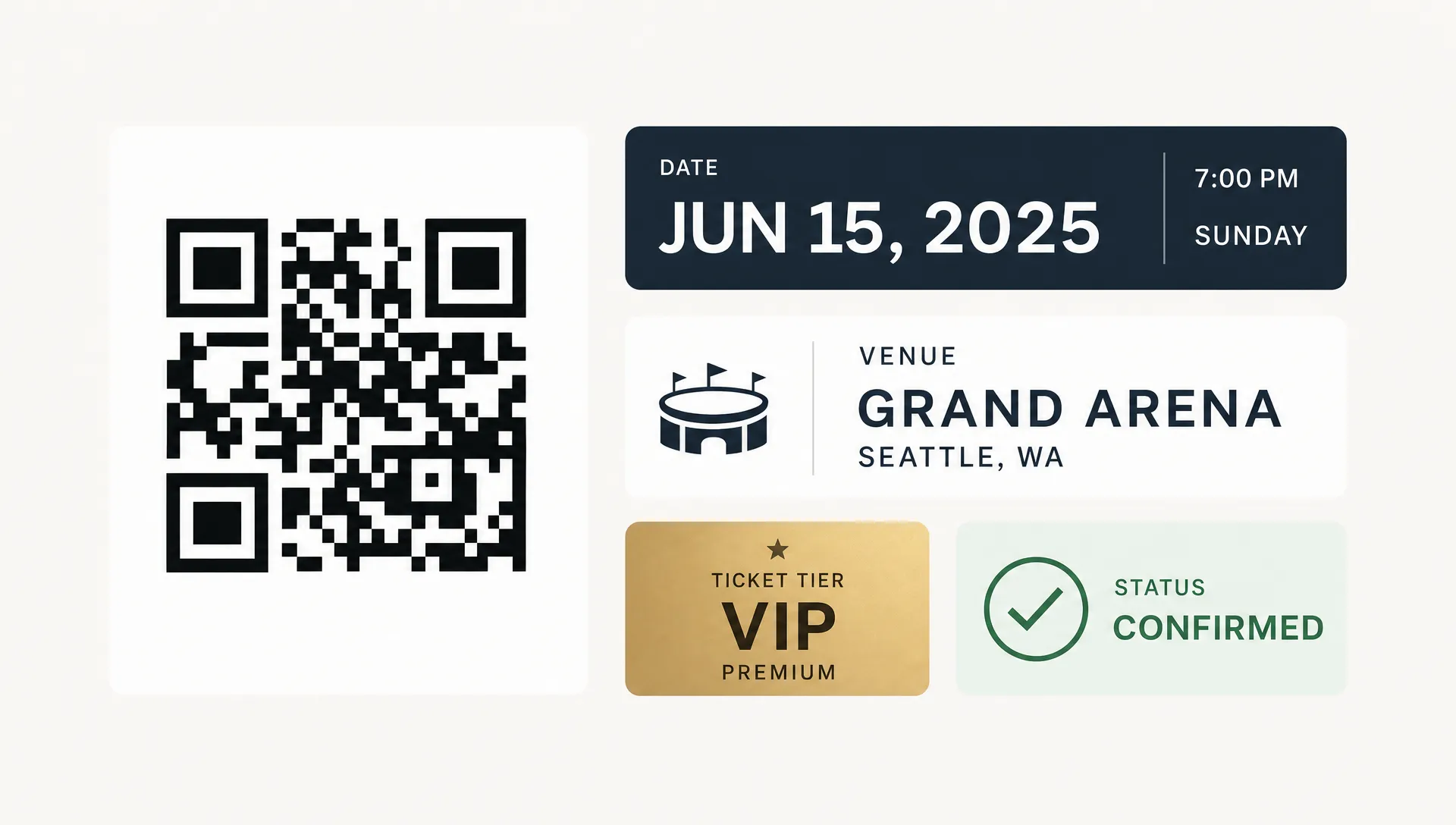
- Buyer scanning: The attendee wants to confirm the event, date, venue, start time, ticket type and any entry instructions.
- Door scanning: Your team needs the validation code, attendee name, ticket status and any tier-specific access details.
If your design favors only one moment, the experience suffers. A ticket that looks great in an inbox may still slow down the door if the QR code is tiny. A ticket built only around a large code may still cause support messages if the venue entrance or time is unclear.
The best layouts make both jobs obvious.
Start with a clear information hierarchy
Before choosing colors or adding a background image, decide what the buyer must notice first, second and third. A ticket is not a poster. It is a utility document with brand value attached.
A useful hierarchy looks like this:
| Priority | Information | Why it matters | Layout treatment |
|---|---|---|---|
| 1 | Event name | Confirms the buyer has the right ticket | Large, top placement, easy to read |
| 2 | Date and start time | Prevents no-shows and timing confusion | Close to event name, not hidden in body text |
| 3 | Venue name and address | Helps buyers plan arrival | Clear label, map-friendly address format |
| 4 | Ticket type | Tells buyer and staff what access is included | Prominent badge or row near the code |
| 5 | QR code or barcode | Enables fast validation | Large, high contrast, isolated from clutter |
| 6 | Attendee or order details | Helps resolve exceptions | Smaller, but easy for staff to find |
| 7 | Policies and instructions | Reduces disputes and support questions | Short, plain language, placed after core details |
This order keeps the ticket useful at a glance. A buyer should not have to read a paragraph to know whether they bought General Admission, VIP, Early Entry, Backstage Access or a group pass.
For music events, tier clarity is especially important. A producer or promoter may be selling early bird tickets, final release tickets, artist guest list spots, table packages and backstage passes for the same night. If all those tickets look almost identical, your door team has to make judgment calls under pressure.
Keep the top section brutally simple
The top third of the ticket should answer three questions immediately:
- What event is this?
- When is it happening?
- Where do I go?
Use the event name as the main headline. Under it, place the date and time in a format that cannot be misread. For example, “Saturday, October 10, 2026 at 9:00 PM” is clearer than “10/10/26, 9 PM,” especially if you attract visitors from different date-format regions.
Then show the venue name and full address. If there are multiple entrances, put the entrance instruction near the address instead of burying it in a policy section. “Use North Entrance on 3rd Ave” belongs where the buyer is already checking arrival details.
Avoid placing sponsor logos, decorative taglines or long descriptions above these basics. Those elements can still appear, but they should not compete with the information people are most likely to need.
Make the validation code impossible to miss
Your QR code or barcode is the operational center of the ticket. If it fails, the ticket layout has failed no matter how polished it looks.
A reliable code area has a few simple traits. It is large enough to scan from a normal phone screen. It has strong contrast. It has blank space around it. It is not placed over a photo, gradient or pattern. It is not squeezed beside a long block of text.
For most digital tickets, the code should sit in its own zone with a short label like “Scan at entry.” If your platform also displays a backup confirmation number, place it near the code so staff can use it during edge cases such as a cracked screen, poor connection or scanner issue.
Do not decorate the code. Adding a logo inside a QR code, changing its colors aggressively, or placing it on a dark textured background may look on brand but can reduce scan reliability. If you want to improve the operational side of your tickets, pair the layout work with a process for creating tickets that are ready for fast check-in from the start.
Use labels buyers understand
Fast scanning depends on plain labels. Do not assume every buyer understands your internal naming system.
“Tier 2” may make sense inside your sales dashboard, but “General Admission, Final Release” is clearer to the person standing in line. “Access A” may be useful for operations, but “VIP Balcony Access” tells the buyer what they purchased.
The same rule applies to dates and times. “Doors 8 PM, Show 9 PM” is better than only showing one time if the distinction matters. For festivals, conferences, workshops and multi-room events, state the applicable session or day clearly.
Here are common labels worth standardizing across every ticket:
- Event
- Date
- Doors open
- Start time
- Venue
- Entrance
- Ticket type
- Attendee
- Order ID
- Scan at entry
You do not need all of them for every event. A small invite-only listening party may need fewer details than a multi-stage festival. The point is consistency. Once your team uses the same label structure across events, buyers learn where to look and staff can resolve questions faster.
Build the layout mobile first
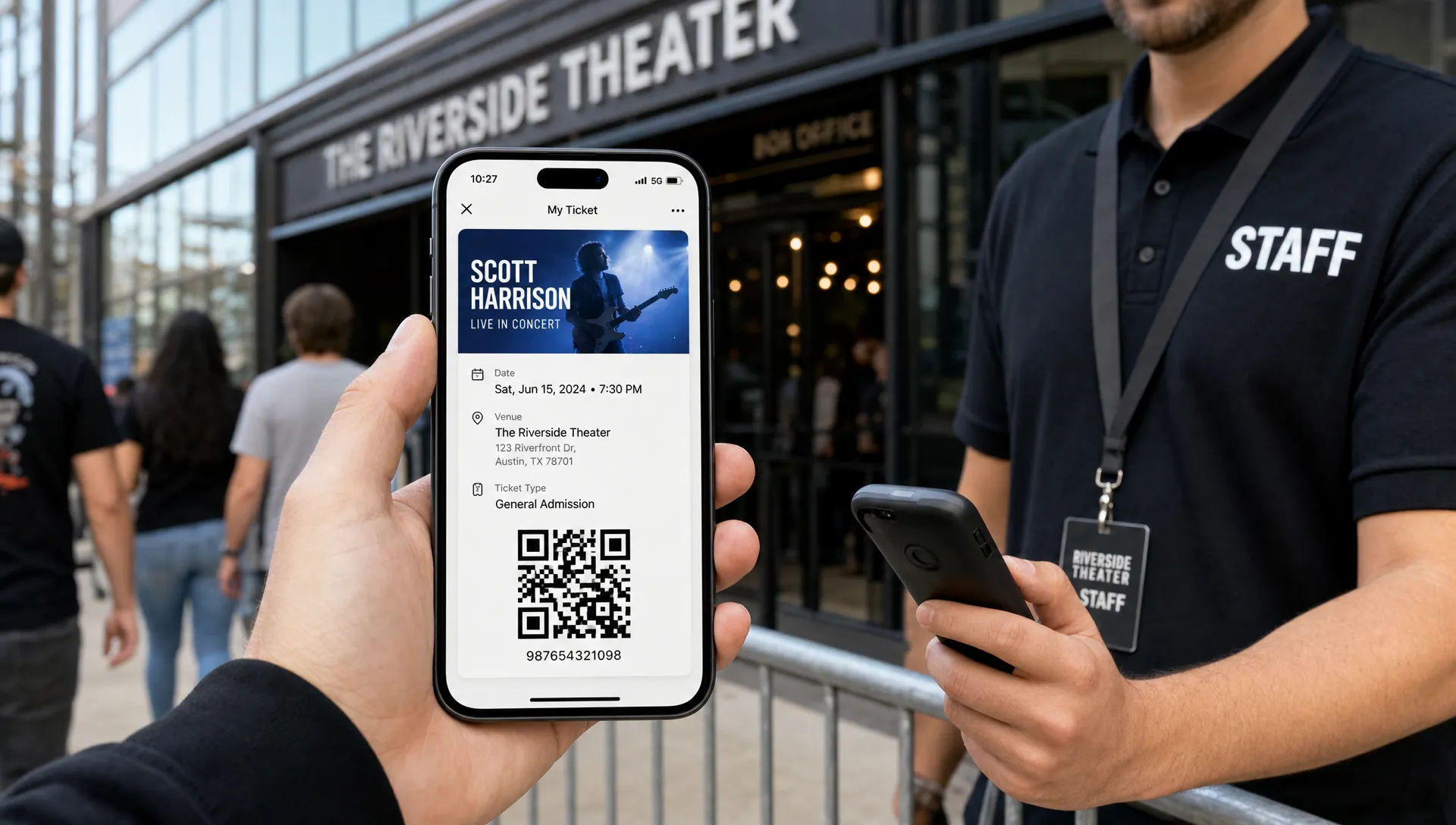
Many buyers will never print their ticket. They will open it from email, a wallet, a confirmation page, a screenshot, or a forwarded message. That makes mobile readability non-negotiable.
A mobile-first event ticket layout uses one main column, strong spacing and text sizes that remain readable on a small screen. It avoids tiny footnotes for anything operationally important. It does not rely on a wide desktop-style design where the code sits on one side and details sit far away on the other.
Test the layout on the devices your audience actually uses. Open the ticket at normal brightness, not only on a large monitor. Check it outdoors if your event has daytime entry. Check it in low light if you run club nights or concerts. If a buyer has to pinch and zoom to find the address or ticket type, the layout is doing too much.
Let branding support the scan path
Branding matters. A ticket is part of the event experience, especially for concerts, pop-ups, festivals and premium gatherings where the visual identity helps build anticipation.
But branding should frame the content, not fight it. Use your logo, event colors and a recognizable visual style, then protect the readable zones. A strong layout might use a branded header, a clean white or dark content card and a bold ticket-type badge. It does not need a full-bleed flyer image behind every field.
If you want the ticket to feel more distinctive, add brand personality in controlled places:
- Header area with event artwork or logo
- Accent color for ticket type badges
- Footer message with a short event tagline
- Confirmation text that matches your event voice
- Subtle background shapes that do not sit behind the code
This is where many event teams overcorrect. They make the ticket look like a mini poster, then wonder why buyers miss key details. If brand consistency is a priority, focus on ways to customize tickets for a stronger event brand without sacrificing entry speed.
Separate access details from marketing copy
A ticket should not carry the full burden of selling the event. By the time someone is looking at it, they have already bought. The layout should now help them attend.
Keep promotional text short. A line like “We can’t wait to see you on the dance floor” is fine. A long paragraph about the lineup, sponsor message, dress code, merch offer and afterparty can bury important information.
If you need to include rules, make them concise and specific. “21+ with valid ID” is better than a general policy paragraph. “No re-entry” should be visible if it affects buyer behavior. “Last entry 11:30 PM” should be near entry instructions, not hidden below legal text.
For events with many conditions, consider splitting content into zones:
| Zone | Purpose | Example content |
|---|---|---|
| Header | Recognition | Event name, logo, date |
| Details | Planning | Time, venue, entrance |
| Access | Validation | Ticket type, QR code, attendee name |
| Instructions | Arrival | ID required, bag policy, last entry |
| Support | Help | Order ID, contact path, refund note if applicable |
This structure gives every piece of information a job. If a detail does not help buyers attend or help your team validate entry, it probably does not belong on the ticket.
Design ticket tiers so staff can act quickly
Unlimited ticket tiers and flexible pricing can help organizers maximize revenue, but they also add layout complexity. If you sell multiple tiers, the ticket type must be visually obvious.
For example, do not rely only on a small line of text that says “VIP.” Use a badge, block, color band, or large label. If VIP includes early entry, show “VIP, Early Entry” rather than only the product name used at checkout. If a table package admits four guests, show the quantity and access rule clearly.
This protects the buyer experience and your cash flow. Every unclear ticket creates a possible exception at the door. Exceptions slow the line, distract managers and sometimes lead staff to grant access manually just to keep things moving. Clear tier design reduces those moments.
For music producers and promoters, this can be the difference between a smooth first hour and a chaotic one. The door is where your online setup meets reality. If the ticket tier, scan code and guest identity are easy to find, your team can focus on hospitality instead of interpretation.
Make accessibility part of the layout, not an afterthought
Accessible design also makes tickets faster for everyone to read. High contrast, plain language and clear spacing help buyers in bright sunlight, dark venues, crowded lines and stressful travel situations.
The W3C Web Content Accessibility Guidelines recommend a contrast ratio of at least 4.5:1 for normal text. Even if your ticket is not a full web page, that benchmark is useful when choosing text and background colors.
Pay attention to these practical details:
- Use readable font sizes for event details and ticket type.
- Avoid thin typefaces for critical information.
- Do not use color alone to distinguish tiers.
- Leave enough spacing between sections.
- Keep policy text short enough to be readable.
A black background with neon purple text might match your event art, but it can be hard to read on older phones or dim screens. Use the bold brand color as an accent and keep the functional content clear.
Test the ticket like a real attendee
The fastest way to improve a layout is to test it in real conditions before sales volume builds. Send a test ticket to your phone and ask someone outside the event team to answer basic questions from it.
Can they find the date in three seconds? Can they tell which entrance to use? Can they identify the ticket tier? Can the QR code be scanned without zooming? Can they read the ticket with brightness turned down?
Then test your door flow. Give your check-in team a few sample tickets with different tiers, promo codes and attendee names. Watch where they look first. If they pause in the same place repeatedly, the layout needs adjustment.
This test is simple, but it catches issues that design reviews miss. A ticket can look balanced in a mockup and still fail when a staff member is scanning 300 people in a fast-moving line.
Connect ticket layout to the full buying flow
A clean ticket cannot fully fix a confusing purchase process. If buyers had to create an account, decode fees, choose between unclear tiers, or wait for a confirmation email, they may already be anxious before they open the ticket.
The best experience feels consistent from checkout to entry. The same ticket type names should appear on the event page, checkout screen, confirmation email and ticket. Pricing should be transparent. Delivery should be immediate. If you are refining the ticket itself, it is worth reviewing how you simplify event payment flows for attendees too.
For organizers who care about cash flow, this consistency matters. Fewer buyer questions mean fewer manual interventions. Faster checkout means fewer abandoned purchases. Faster entry means fewer comps, disputes and door decisions made under pressure.
Event ticket layout checklist
Use this checklist before publishing your next event:
- The event name is the most visible text on the ticket.
- Date, time, venue and entrance are visible without zooming.
- The ticket type is obvious at a glance.
- The QR code or barcode has strong contrast and enough blank space.
- The layout works on a phone screen, not only in a desktop preview.
- Branding does not sit behind critical information.
- Policy text is short, specific and placed after core details.
- Each ticket tier has a clear label buyers and staff can understand.
- The design has been tested by someone outside the event team.
A great ticket layout is not about adding more information. It is about making the right information easier to find.
Frequently Asked Questions
What should be included in an event ticket layout? Include the event name, date, start time, venue, entrance instructions, ticket type, attendee or order details, a QR code or barcode and any critical entry rules such as age restrictions or last entry time.
Where should the QR code go on an event ticket? Place the QR code in a dedicated, high-contrast area with blank space around it. It should be large enough to scan from a phone screen without zooming and should not sit over artwork, gradients, or busy backgrounds.
How can I make a ticket easier for buyers to scan visually? Use a clear hierarchy, plain labels, generous spacing and mobile-friendly text sizes. Keep the event name, date, venue and ticket type near the top, then place the validation code in its own obvious section.
Should event tickets include branding? Yes, but branding should support clarity. Use logos, colors and event artwork in controlled areas while keeping critical details and scan codes clean, readable and separated from visual clutter.
Why does ticket layout affect cash flow? A clear layout reduces buyer support requests, entry delays and manual exceptions at the door. That helps organizers keep operations smoother, protect paid access and spend less time resolving preventable confusion.
Build tickets that buyers and door teams can read fast
Your ticket is more than a receipt. It is the bridge between purchase and entry, and its layout can either speed up the experience or create friction when timing matters most.
TixFlow helps organizers create a smoother ticketing flow with easy setup, customizable event pages, flexible ticket tiers, smart promo codes, digital guest lists, Stripe Connect integration, low fees and instant payouts. If you want buyers to move from checkout to entry with less friction, start with a ticketing platform built for speed and control.