
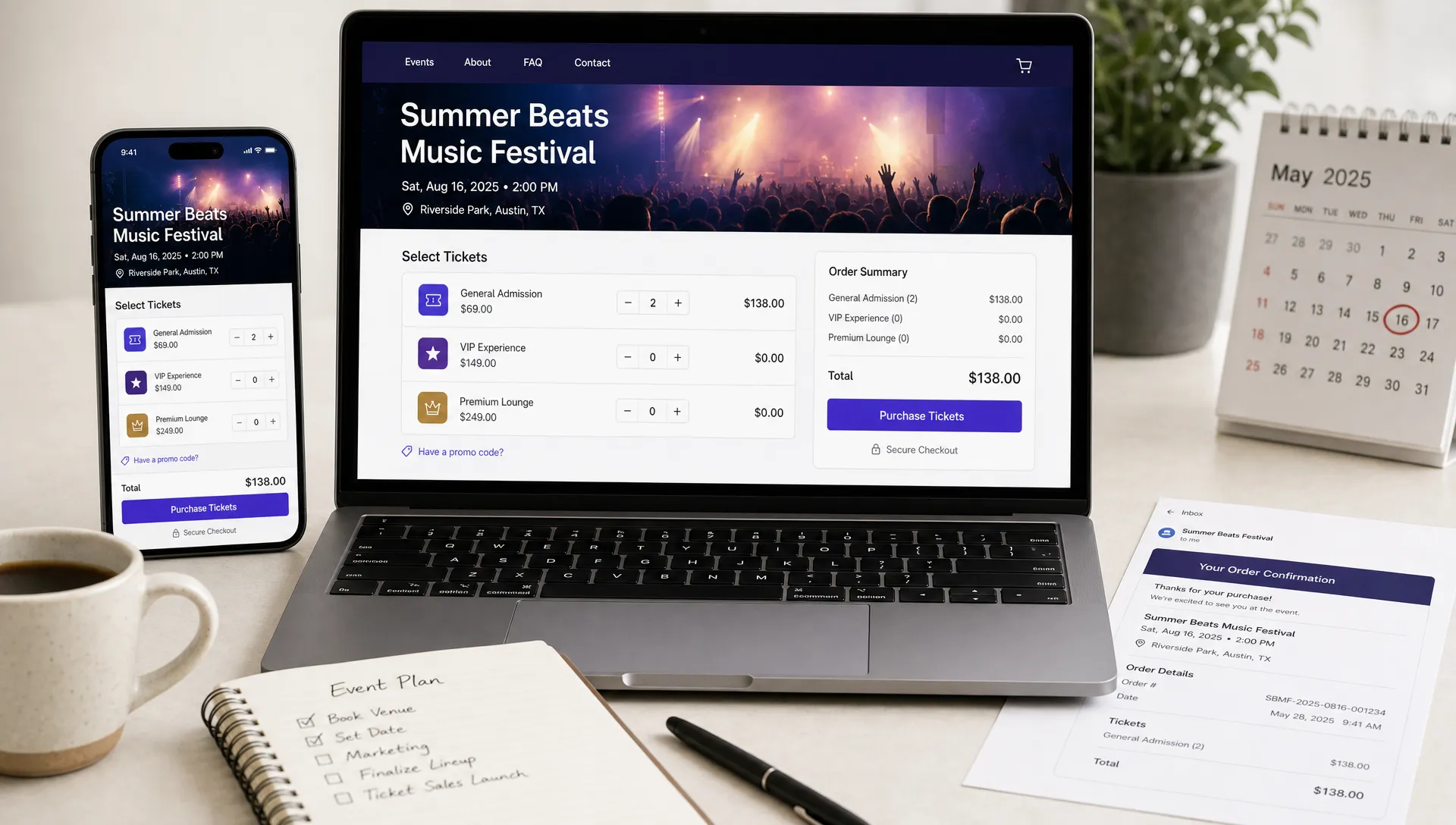
What Makes a High-Converting Ticketing Website
A high-converting ticketing website is not just a page where people can buy tickets. It is the place where interest turns into commitment. If the page creates doubt, hides key details, adds unnecessary steps, or feels disconnected from the event brand, potential attendees leave before they pay.
For organizers, conversion is often won or lost in small moments: whether the date is obvious, whether the price feels transparent, whether the checkout works on mobile, whether guests can buy without creating an account, and whether the confirmation arrives instantly. In 2026, attendees expect the same speed and clarity they get from modern ecommerce, travel booking, and food delivery apps.
The best ticketing websites combine persuasive event storytelling with a low-friction purchase path. They answer the attendee’s questions before hesitation appears, then make buying feel fast, safe, and final.
Start with the attendee’s decision process
Before someone buys a ticket, they are usually asking a few quiet questions: Is this event worth my time? Can I trust the organizer? Who else is going? What exactly do I get for the price? What happens after I pay?
A high-converting page does not make people hunt for those answers. It presents the core promise immediately, then supports it with the right details. The top of the page should make the event instantly understandable, especially on mobile. At minimum, the first screen should clarify the event name, date, location or online format, starting price, and primary call to action.
This is where many event pages go wrong. They lead with a poster or a long description, but the buying information is buried below. A beautiful visual can create interest, but conversion depends on clarity. If an attendee has to scroll, zoom, or open another tab to find basic information, the page is already leaking sales.
Think of your ticketing website as a guided path, not a digital flyer. The job is to move visitors from curiosity to confidence to purchase.
Make the value obvious above the fold
The first section of the page should answer “Why should I attend?” in plain language. That does not mean writing a long pitch. It means giving people a fast reason to care.
For a concert, that reason may be the lineup, venue, atmosphere, or limited capacity. For a workshop, it may be the practical outcome attendees will leave with. For a conference, it may be the speakers, networking access, or industry relevance.
Strong above-the-fold sections usually include:
- A clear event headline that says what the event is, not just what it is called
- The date, time, and location in a scannable format
- A short value proposition that explains why the event matters
- A visible ticket button that works naturally on mobile
- The lowest available price or a clear “from” price if tiers vary
The goal is not to answer everything immediately. The goal is to give people enough confidence to keep moving.
Build for mobile speed first
Most attendees will discover events through mobile channels: Instagram stories, group chats, email, search, creator pages, and paid social ads. If your ticketing page is slow or awkward on a phone, your marketing spend becomes less efficient.
Google’s guidance around Core Web Vitals is useful here because it focuses on real user experience, including loading speed, interaction responsiveness, and visual stability. For ticketing, these technical details translate into revenue. If the ticket selector jumps around while loading, if the checkout button is hard to tap, or if a payment page freezes, people abandon the purchase.
Mobile optimization is not only about page speed. It is also about decision speed. Short sections, readable text, large tap targets, autofill-friendly forms, and a visible order summary all reduce mental effort.
| Conversion element | Why it matters | What to check |
|---|---|---|
| Page load speed | Slow pages lose impatient buyers | Test on mobile data, not just office Wi-Fi |
| Sticky or repeated CTA | Visitors should never wonder how to buy | Keep the ticket button visible after key sections |
| Simple ticket selector | Confusing tiers create hesitation | Use clear tier names, prices, and availability |
| Mobile payment flow | Most impulse purchases happen on phones | Avoid tiny fields, unnecessary redirects, and hidden fees |
| Confirmation experience | Buyers need instant reassurance | Show clear success messaging and send tickets quickly |
A good rule: if someone hears about your event from a friend and opens the page while standing in line for coffee, they should still be able to understand the offer and buy without friction.
Remove forced registration from checkout
Forced account creation is one of the most common avoidable conversion blockers. People came to buy a ticket, not to create another password. If the checkout interrupts them with registration, email verification, or profile setup, it adds effort at exactly the wrong moment.
Baymard Institute’s checkout research has repeatedly shown that avoidable checkout friction, including forced account creation, contributes to abandonment. In event ticketing, this is especially important because many purchases are time-sensitive or socially driven. Someone may be buying because a friend sent a link, because a tier is about to sell out, or because they just saw a post from the organizer.
Guest checkout keeps that momentum intact. The buyer should only provide what is necessary to complete the purchase and receive the ticket. If you want to build a long-term audience, collect permission after the sale rather than blocking the sale itself. TixFlow’s approach of no buyer registration aligns with this principle, and organizers can explore the impact in more detail in this guide on why guest checkout helps increase ticket sales.
The best checkout feels almost invisible. Select ticket, enter details, pay, receive confirmation. Every extra step should justify its existence.
Be transparent about price, fees, and availability
Few things damage conversion faster than a price that changes unexpectedly at checkout. Attendees may accept fees, taxes, or limited availability, but they dislike surprises. A high-converting ticketing website shows pricing clearly and explains what is included.
If your event uses multiple ticket tiers, each tier should have a distinct purpose. “General Admission,” “Early Bird,” “VIP,” and “Group Ticket” are easy to understand. Vague tier names or unexplained price differences create uncertainty.
Availability cues can also improve conversion when they are honest. Showing that early bird tickets end on a specific date or that a tier has limited capacity helps attendees make a decision. The key is to avoid fake urgency. Manipulative countdowns and artificial scarcity may create short-term sales, but they erode trust.
Dynamic pricing, sales phases, and limited tiers work best when they reflect real event strategy. For example, early supporters can receive better pricing, VIP attendees can receive meaningful added value, and last-minute buyers can pay a premium if demand is high. If you are building a pricing model, this guide to dynamic ticket pricing strategy offers a useful deeper dive.
Design the checkout to reduce doubt
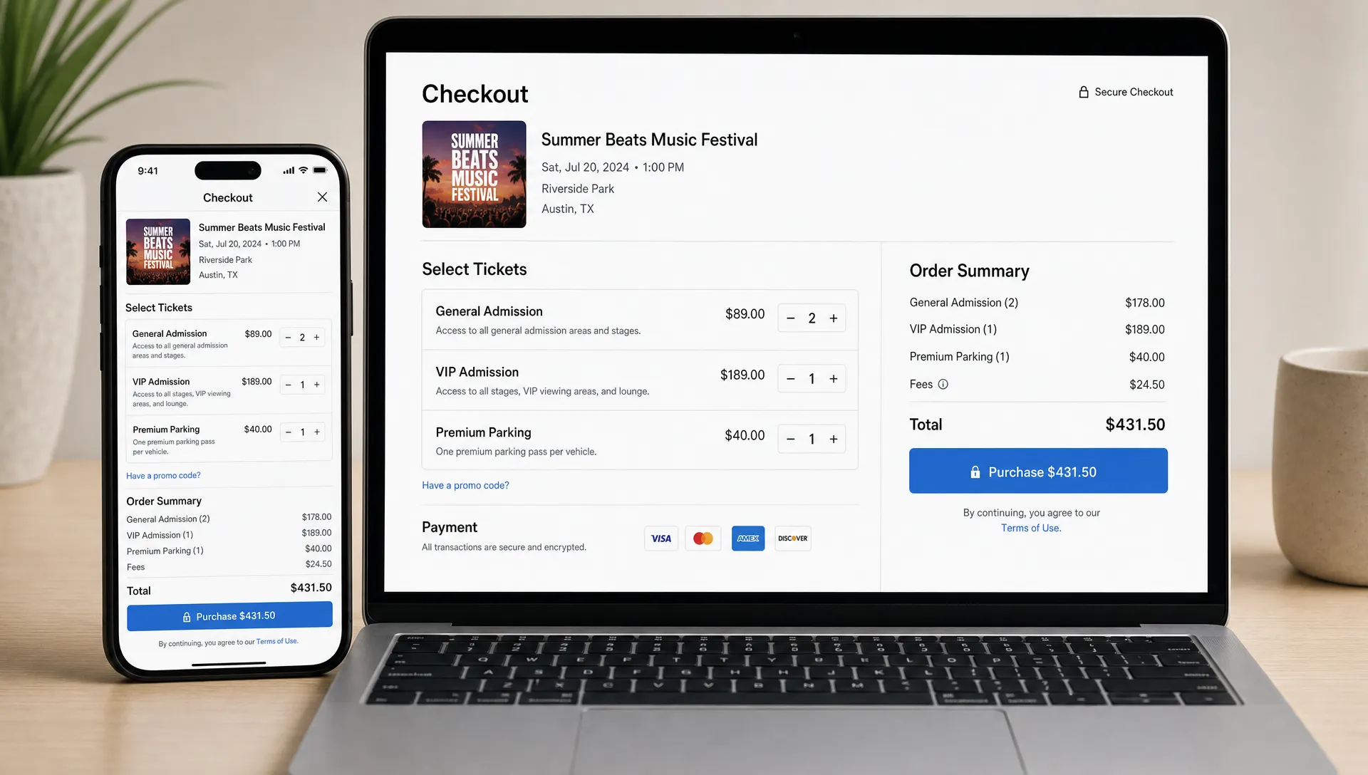
Checkout is not the place for surprises, long copy, or unnecessary decisions. It should confirm what the buyer selected, show the full cost, offer a familiar payment method, and make the next step obvious.
High-converting ticket checkout pages usually share a few traits. The buyer can edit quantities without starting over. The order summary remains visible. Required fields are clearly marked. Error messages explain what to fix. The payment button uses direct language such as “Buy ticket” or “Complete purchase.”
The psychology matters as much as the layout. At checkout, attendees are no longer browsing. They are deciding whether to trust the transaction. Security indicators, recognizable payment flows, clear refund or transfer information, and immediate ticket delivery all help.
This is also where a ticketing platform can have a measurable impact. Features like customizable checkout, Stripe Connect integration, smart promo codes, and automated sales phases reduce manual work for organizers while keeping the buyer experience consistent.
Borrow conversion lessons from other transaction-heavy platforms
Event ticketing is part of a broader category of high-trust online transactions. People are not just clicking a button. They are paying money, sharing personal information, and expecting access to something later. That means the page must balance speed with credibility.
Other industries solve similar problems. Ecommerce optimizes cart flow, travel platforms clarify itinerary details, and regulated gaming products focus heavily on onboarding, payments, security, and compliance. For instance, modular iGaming platforms package payment support, fraud prevention, mobile optimization, and operational controls into a single user journey, which reflects the same broader lesson: conversion improves when trust and usability are built into the transaction instead of added later.
For event organizers, the takeaway is simple. Do not treat ticket sales as a passive form submission. Treat them as a performance funnel where every step needs to earn the buyer’s confidence.
Make the page feel like the event brand
A ticketing website that looks generic can still sell, but it has to work harder. Brand consistency reassures visitors that they are in the right place, especially if they arrive from a social post, artist page, venue site, newsletter, or sponsor campaign.
Consistent branding does not mean overdesigning the page. It means the colors, imagery, tone, and layout should feel connected to the event experience. A premium tasting event should not feel like a basic spreadsheet checkout. A late-night music event should not feel like a corporate webinar registration page. A community fundraiser should feel warm, credible, and mission-driven.
The checkout should also maintain that continuity. If the buyer clicks from a branded event page into a completely different-looking payment flow, trust can drop. Customizable event pages and checkout experiences help organizers keep the experience cohesive from first click to final confirmation.
Use social proof without cluttering the page
Social proof can increase conversion, but only when it supports the decision. Too many logos, testimonials, embedded feeds, or sponsor badges can distract from the purchase path.
The best social proof depends on the event type. For a recurring event, photos from previous editions may be persuasive. For a professional conference, speaker credibility and partner logos matter. For a creator-led event, audience quotes or community size may help. For a venue-based event, recognizable performers or past sold-out dates can provide confidence.
Keep social proof close to the decision point it supports. If people may wonder whether the event is legitimate, add credibility near the top. If they may wonder whether VIP is worth it, place proof near the ticket tier explanation. If they may worry about entry logistics, explain digital ticket delivery and guest list handling near checkout.
Give organizers real-time control
A high-converting ticketing website is not only what attendees see. It is also what organizers can adjust while sales are live.
Real-time control matters because demand changes. A campaign may outperform expectations. A sponsor may request a code. A ticket tier may need to close early. A sales phase may need to start automatically at midnight. If every change requires manual work, developer help, or platform support, the organizer loses speed.
Modern ticketing operations benefit from flexible pricing, unlimited ticket tiers, automated sales phases, and smart promo codes. These tools let organizers adapt the offer without rebuilding the event page. Digital guest lists also connect the online purchase to the real-world entry experience, which matters because conversion does not end at payment. A smooth door experience makes attendees more likely to return and recommend the next event.
Instant payouts and flat per-ticket fees also influence the organizer’s ability to scale. Cash flow affects marketing, vendor payments, staffing, and production decisions. When the sales system creates financial uncertainty, organizers become more cautious. When payout timing and costs are clear, planning becomes easier.
Measure the funnel, not just total sales
Total ticket sales matter, but they do not explain where opportunities are being lost. A high-converting ticketing website should be evaluated as a funnel: visitor, ticket selector interaction, checkout start, payment completion, ticket delivery, and event check-in.
Even simple measurement can reveal useful patterns. If traffic is high but ticket selection is low, the page may not communicate value clearly. If checkout starts are high but purchases are low, the issue may be fees, payment friction, forced registration, or lack of trust. If purchases are strong but check-in is chaotic, the online experience is not carrying through to entry.
| Funnel signal | Possible issue | Optimization idea |
|---|---|---|
| High traffic, low ticket clicks | Event value is unclear | Improve headline, date visibility, and CTA placement |
| High ticket clicks, low checkout starts | Ticket tiers are confusing | Simplify tier names and explain differences |
| High checkout starts, low completions | Payment or form friction | Remove unnecessary fields and support guest checkout |
| Many promo code attempts | Discount messaging is unclear | Clarify active codes or remove expired campaigns |
| High support questions after purchase | Confirmation lacks detail | Improve ticket email, entry instructions, and refund information |
Optimization is rarely one big redesign. More often, it is a series of small improvements that reduce hesitation at each step.
High-converting ticketing website checklist
Use this checklist before launching your next event page. It can help you spot conversion issues before paid traffic, influencer promotion, or email campaigns begin.
- The event name, date, time, location, and starting price are visible without effort.
- The main call to action is clear, repeated naturally, and easy to tap on mobile.
- Ticket tiers have simple names, clear benefits, and transparent pricing.
- Buyers can purchase without creating an account.
- Fees, taxes, refund terms, and entry requirements are not hidden.
- The checkout flow uses minimal required fields and familiar payment methods.
- The page looks connected to the event brand and source campaign.
- Promo codes and sales phases are easy to manage without manual chaos.
- Confirmation messages explain what happens next.
- The organizer can monitor and adjust sales while the event is live.
If several items are missing, the issue is not just design. It is revenue leakage.
Frequently Asked Questions
What is a ticketing website? A ticketing website is an online page or platform where attendees can learn about an event, choose ticket types, complete payment, and receive digital tickets or confirmation for entry.
What makes a ticketing website high-converting? A high-converting ticketing website combines clear event information, mobile speed, transparent pricing, guest checkout, trusted payment flow, strong branding, and instant confirmation.
Does guest checkout really improve ticket sales? Guest checkout can improve sales because it removes a major source of friction. Buyers can complete the transaction without stopping to create an account, verify credentials, or remember a password.
How many ticket tiers should an event page have? Use as many tiers as needed to match your pricing strategy, but keep the choice clear. Too many similar tiers can slow down decisions, while well-defined tiers can increase average order value.
Why does mobile design matter so much for event ticketing? Many attendees discover events on mobile through social media, messaging apps, email, and ads. If the page is slow or hard to use on a phone, interested buyers may leave before checkout.
Turn more event interest into ticket sales
A high-converting ticketing website is fast, clear, trustworthy, and easy to control. It helps attendees say yes without confusion, and it gives organizers the flexibility to manage sales as demand changes.
TixFlow is built for modern event organizers who want instant payouts, low fees, easy setup, no buyer registration, flexible pricing, real-time sales control, customizable event pages, smart promo codes, digital guest lists, and a smoother checkout experience. If your event page is getting attention but not enough completed purchases, improving the ticketing flow may be the highest-impact place to start.